Simplicity in design is not a new invention. Akzidenz-Grotesk, the font used in the DesignStreet logo, was first released in 1896 and we like to think it looks crisp and modern to this day. Moving into the 20th Century, Ernst Keller and his teachings of the Swiss Style placed an emphasis on objectivity, design that prioritises content and a reliance on grids as a means to structure information. These conventions allowed the content to be understood quickly by everyone who could read them. However, with the spread of international travel and globalised communication in the aftermath of the Second World War, the need to be understood without a common language became increasingly vital.
This wave of post-war globalisation dramatically increased the prominence of the Olympic Games. The Games provided a positive source of national pride and international community, and the advent of live television broadcasting meant that the whole world could really be watching, wherever they were. Though pitched as a world event, historically the Games had been very western-centric. However, this changed in 1964 when they were held in Tokyo, the first time they had been held outside Europe, the USA or Australia.
At the 1960 World Design Conference, held in Tokyo, some of the world’s top designers, artists and architects worked on how to meet the new need for communication that went beyond words. To them, the forthcoming Olympics represented an obvious crystallisation of the desire to create a style of communication that did not rely on linguistic understanding. This was particularly true for these Games, as they were taking place in a non-western country for the first time.

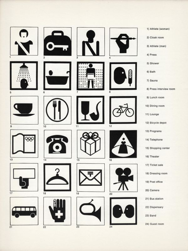
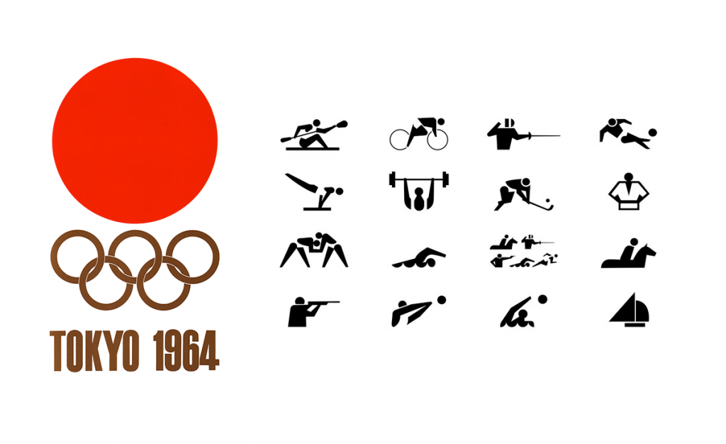
Simple images were designed to represent each sport, along with others to represent the other facilities available to competitors and fans. They contained no words, could be shown purely in black and white and distilled any people shown down to their simplest components. The best example of how fundamental this set of images has been to design in public spaces is the now-ubiquitous male/female bathroom images, seen here for the first time. Along with the similar project being undertaken by British Rail at around the same time, these design guides represent to most the birth of the modern field of pictography.
In addition, the design used on all other materials from posters to baggage tags were completely stripped back. Compare the two posters shown below: the 1956 Olympic Games held just down the road from us in Melbourne had an illustrated, hand-designed feel that used many different fonts, weights and visual elements. The imagery is simplified and iconographic, but the presentation is busy. The 3 different visual elements of the illustration are layered on top of each other and all exist in their own 3D spaces that interact with each other, but none of these spaces appear to follow the same rules of geometry. By contrast, the poster for the 1964 Games in Tokyo presents all of the same information with the absolute minimum of design elements. 2 colours on a plain, flat background and a single font are all that is needed to convey not only the relevant information, but also modernity and national identity.
In the present day flat, clean pictographic design is now so universal that to most it is no longer even seen as design; in many cases the images have captured the essence of what they represent so innately that the designer becomes invisible and all that is left is what is represented. We see these as inspirations and strive to create design that is unobtrusive and natural. This means that when people see our designs for you, they see you and your brand free from obstruction.

