When it comes to email marketing and eDMs, the humble Call-to-Action (CTA) button often gets overlooked. Yet, this small but mighty design element can make or break your campaign’s performance. A CTA isn’t just a button; it’s a gateway to conversions. When strategically designed and placed, it can guide your audience seamlessly through their journey—from curiosity to action. Here, we’ll share actionable tips to optimise your CTAs with superior design and placement while keeping User Experience at the forefront.
1. Prioritise Clarity in Design
Your CTA needs to grab attention at a glance. Opt for a bold colour that contrasts sharply with the surrounding design. The button’s text should be concise, action-oriented, and easy to read. Phrases like “Download Now,” “Get Started,” or “Learn More” clearly communicate the action you want your audience to take.
Pro Tip: Use a consistent font style and size for your CTAs across campaigns. Consistency builds familiarity and trust, especially in B2B communications where audiences expect professionalism.
2. Strategic Placement Matters
Where you place your CTA can significantly impact click-through rates. Eye-tracking studies suggest that email marketing CTAs perform best when placed above the fold or at natural stopping points in your email or landing page. Consider the flow of information and ensure your CTA is positioned where it feels intuitive to click.
Key Insight: Use a primary CTA above the fold and a secondary one further down for longer eDMs. This caters to both quick decision-makers and those who need more details before taking action.
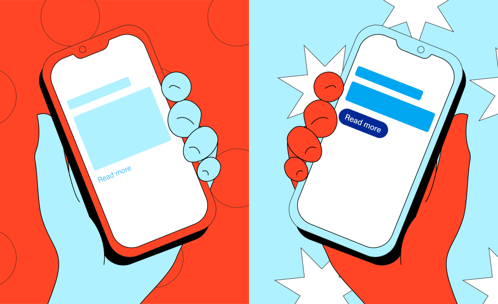
3. Leverage Visual Cues
Directing your audience’s attention to your CTA can be as simple as using arrows, shapes, or whitespace. Subtle animations, like a hover effect, can also enhance engagement without feeling intrusive.
Design Insight: Keep it minimal. Overloading the design with too many elements can detract from the CTA’s prominence.


4. Optimise for Mobile Responsiveness
With the majority of email opens happening on mobile devices, your CTA must be designed for thumbs, not just clicks. Ensure the button is large enough to tap easily and surrounded by ample spacing to avoid accidental clicks.
Statistic Insight: According to Campaign Monitor (2018), including a CTA button can increase conversion rates by 28%, underscoring its critical role in email marketing success. This statistic reinforces how email marketing and well-crafted eDMs can drive measurable business results.

Final Thoughts
The art of the Call-to-Action button lies in the perfect balance of design, placement, and User Experience. By prioritising clarity, strategic positioning, and mobile responsiveness, your CTAs can drive measurable results for your email marketing campaigns. Remember, an optimised CTA isn’t just a button—it’s a powerful tool to transform clicks into conversions.
If you’re ready to elevate your email marketing efforts and craft eDMs with superior design and dedicated strategy, DesignStreet is here to help. Let’s create CTAs that don’t just ask for action—they inspire it.
If you want to find out more about email marketing, check out our other blog about optimising your emails here.