The Paul McCartney “Got Back” concert tour has just rolled its way across Australia. It was a musical event for the ages, with one of rock and roll’s earliest and most enduring artists belting out a 39-song repertoire in an auditory and visual experience that hit the high notes in its impact and perfection.
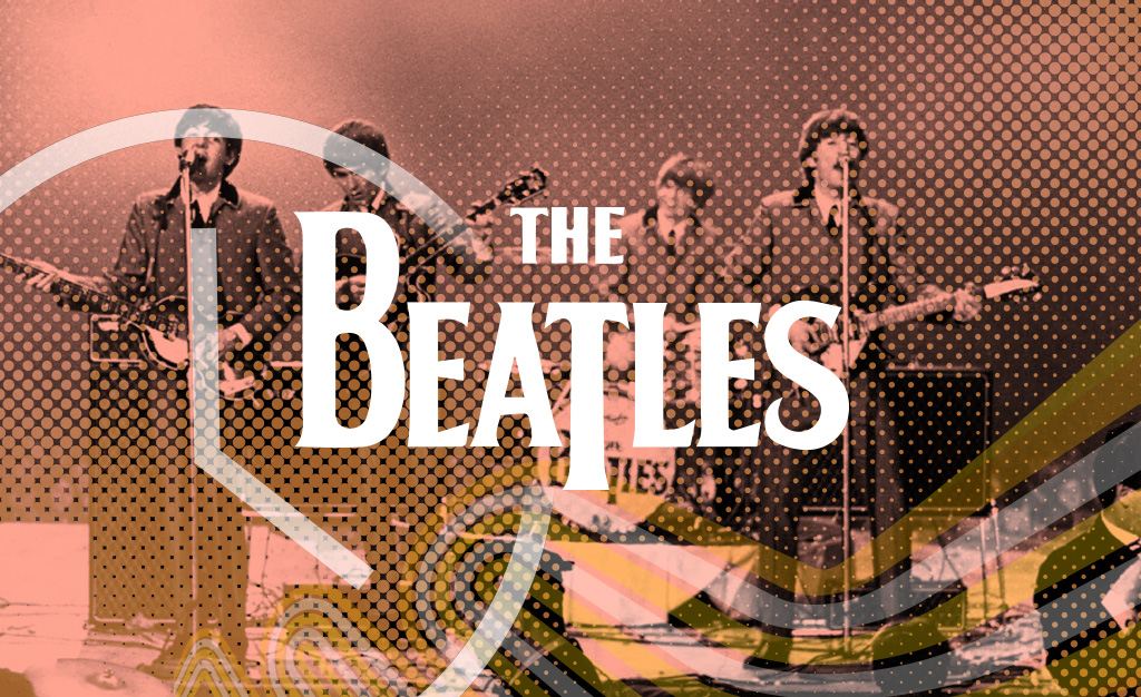
What jumped out in the historical photographs projected backstage were snapshots of The Beatles logo on drumkits, T-shirts and other merchandise of the past. The logo was as striking as the day it first appeared.
The story goes that in 1963, The Beatles were looking for a logo for the front of Ringo Starr’s drumkit. Ivor Arbiter, an instrument retailer, had talked with John Lennon, who discussed the need for a simple and striking design. Arbiter apparently drew the design on the back of a cigarette box and received 5 British pounds for his creation.
The logo is simple and instantly recognisable. It is referred to as the “drop T” design, with a bold, black capital letter “T” descending from the crossbar of the letter to below the bottom line of the other letters, to emphasise the word “beat” in their name. It was a striking visual element for the drumkit and grew into a powerful branding tool for the group, proving a timeless and iconic symbol.
The logo has a clean and minimalist design that echoes the social and cultural revolution that The Beatles helped shape. It continues to resonate powerfully with fans across the globe, and we can be certain that this is one logo that will never change!c
It is fitting that the latest Beatles track, “Now and Then”, was launched on this tour, with the band’s iconic sound perfectly matched by their original logo.
Check out Graham’s previous blog about graphic design technology over 25 years at DesignStreet here.

